UX & UI, grids & colors
Hi there, you're reading Infinum Design slices, bringing you the best UI/UX related news straight to your inbox every 2 weeks.
The story behind Asana’s rebrand
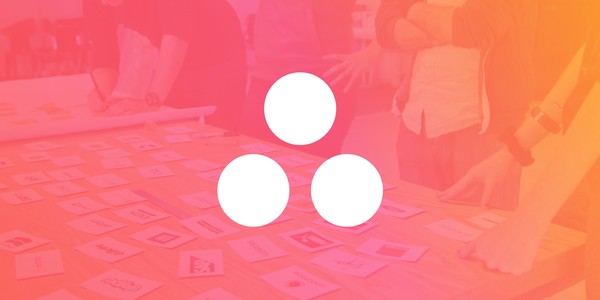
On the surface, this is the story of how Asana went from a logo with three circles to a logo… with three circles. But like most things that seem simple at first blush, there’s a lot more to this story than meets the eye.
Read more
Brands are becoming more digitised, it’s time we relook our approach to branding.
It’s on every job description. You might have even heard it your family mention it at Thanksgiving. But what are the facts on these “design systems” that has the whole industry talking?
A two-part experiment found that different tones of voice have measurable impacts on perceptions of a brand.
New logo and identity system for Mailchimp by COLLINS and In-house.
🛠️ Tools & Resources
Create, save and share perfect palettes in seconds!
💎 Inspiration
A colourful branding that nicely connects digital and printed materials.
A simple example of visual identity being integrated into the app interface.
Klarna is one of Europe’s leading companies for online payments and has the smooothest style in business.